December 16, 2015

Boundin'

Boundin'

Boundin' is another Pixar animated short that I like. Boundin' is about a sheep that dances really well and has this magnificent wool coat. Every other animal around the place where he lives adores him and loves dancing with him. Then he gets buzzed and all the animals mock him. He feels so ashamed and just cant carry on. Then comes a jackalope. The jackalope tells the sheep that life has it's ups and downs and that life won't be all sunshine and roses all the time. And honestly, there isn't anything wrong with the way you've changed and if others have a problem with it, it's there problem now cheer up and bounce back. Be happy and show them wrong by bounding. The sheep is like, whoa, this bounding thing is really fun! and he learns to love himself pink and doesn't care if he has a awesome white coat or is pink.

How was story told?:

Principles of Animation

If you have read my review on One Man Band, you will be somewhat familiar with the Principles of Animation. In case you haven't, the Principles of Animation are guidelines for animators to make their animations look normal, presentable, and something an audience will enjoy viewing instead of falling asleep during.

Appeal: The appeal, or a lot of the appeal, of Boundin is it's story. It is simple enough young children to understand but resonates with middle schoolers and high schoolers because of what addresses. Another  part of it's appeals is the way the story is told and set up. 


Staging: The  lighting plays a huge part in how the story is told. I find that the lack of light and the presence of rain extenuates the sadness the sheep was feeling as compared to the happiness in the stories exposition. Then the entrance of light and the spotlight on the Jackalope as the Jackalope entered. It is an interesting way to show the Jackalopes importance and show that he brought hope.


Another part of the staging is how the environment is set up. The place where the sheep lives is the highest elevation compared to the homes of the other animals that permanently live near him. It implies that the sheep is the main character for one and secondly is the most respected of all the animals.

  
Exaggeration: Exaggeration played a part in the mood and emotion of the Boundin. One way is the rain/sadness cliche (this is a cliche since everybody does it in the industry). It shows that the character is sad instead of just pouting or feeling like life hates them. Another is the lighting of the Jackalope when the Jackalope appears.
Speaking of the Jackalope, he jumps extremely high. Definitely exaggerated. Why? Good question. Maybe because the animators thought it helped the story.

Arcs: If you have taken animation (or physics, or just watched a kid play with a bouncy ball) you will know that everything works in arcs. Thanks gravity. Jumping needs to be done in arcs or else it will look unnatural. And if you've seen Boundin, you know there is a TON of jumping, or as it's called bounding, going on.


Squash and stretch: Squash and stretch is a fancy way of saying that when things are jumping around, in this case the Jackalope and the sheep, their feet, legs, and perhaps body need to get closer together(squash) to stimulate jumping in the air or landing back on the ground and then stretch out in the air to counter the squashing.

Fabulous or not so fabulous?

Facial expressions and facial controls were really well done. Rigging is not an easy feat. Lighting was well done as I don't like lighting and I don't enjoy it myself. The desert landscape was well done and with the rain and snow, applause given to adding in that and looking to the details having everything put together.

What I would have done differently was the rain/sadness cliche. I would have come up with a different way to express sadness in a external way. I would have to think about it about it to think of something else to do, but I would want to be different, you know? And I wouldn't want to deal with making the ground look rained upon. Personally, I feel like the sheep should have his own thing happen to him to show that he's sad. Next little thing, why did the groundhogs leave? There is no explanation given and I'm curious. They either need to make a thing on the Jackalope and the groundhog things or release a statement saying why the left because quite frankly it wasn't addressed.

 Overall, Boundin is pretty fabulous.

What about me?


What I really like about this short in particular is it's use of lighting. I want to be able to light Torn To Pieces in a way similar to that in Boundin. Well control lighting in a way that helps progress the story in way that enhances the story instead of hurts the story.


15 seconds left:

Boundin is a nice animation as it's story was nicely told. Lighting and facial controls were amazing. Enjoyable and has a very nice style to it.
Now if you haven't seen Boundin you should. I really like it.

December 14, 2015

Ain't it pretty?

When the Christmas comes closer you wonder, how productive exactly have I been this semester?
This is a good question. In ways yes. Yes I have. But in some ways, no. How? Well I've been trying to model stuff and make it look nice. So now the semester is at a close I'm asking, isn't my work beautiful?

Well I have been modeling like crazy. I did not want to modeling this dang long but here I am. Not dead. Thank goodness.

Sorry for making this a freaking book, again. But I thought you'd want the juicy details of what I've done this semester and how to not be like me.

Fish

Firstly, DON'T KILL IT! Don't be me please. This was something I happily forgot. Then my lovely peer reminded me that this project was a thing.

Uh this was the first thing I did this year. I did NOT render this out as I've killed the stupid fish about fifteen times. I did not like this project at all. By the time I was at the point to render I was so mentally done with this project and Maya in general that I did not have the mental strength to be able to actually render. I kinda gave up on this project.

With project there where many ways I started to model my fish. Effectively modeling a fish isn't very easy. Even with a reference image. If you want to be it easy, go to visor and import their fish model and then modify it to get the fish want, please use soft select (shortcut being b) when changing the fish. Trust me when I say that it is easier that way. As an animator you want to model effectively not harder. Please don't be like me and bring the wrath of Maya upon you.

What did I get from this project? I got a warm welcome back to school from Maya for starters. I more importantly got a intro bones and rigging in Maya. I am really scared to open the project again to get pictures for you but I will.

Torn To Pieces (TTP)

Like I said earlier, I have been modeling up a storm. I have done a TON with this project even though it doesn't seem like it. Lets take a look.

Well I needed an environment. So for this I started with the living room. I made a couch and a side table. I duplicated them so the space looks used and like it was well used. I also made a coffee table. Then I made a flat screen TV. I textured everything. It was a pain in the butt. I don't really enjoy the couch texture but I couldn't find one I liked better and looked more normal and life like, so I left it as is.For the TV I put a still from Once Upon A Time. I thought the still fit with the idea of TTP. For the tables, I wanted them to be fancy looking. So I made the top of the table a slab of glass that was engraved on the bottom. To hold up the glass top, I made metal legs. The legs are really simple which is nice because I don't have time to be making it to fancy

Then I also made a kitchen. I made the kitchen because there was no door between the living room and the kitchen and if the camera ever looked in the direction of the kitchen I wanted it to look like there was somebody living there and it wasn't a random room floating in the middle of nowhere. I made this nice and fancy I wanted to tie the living room and the kitchen together and the level of fanciness seemed like the best way to go. I'm really happy with the table and chair set. I feel like it has a level of sophistication that the living room had. I also LOVE the backsplash. It's just so fancy and pretty. I would love to have it in my future home. But thanks to this modeling and texturing experience I can not go to Home Depot without getting the urge to take pictures to get textures. The cabinets and appliances were a pain to texture, but I do like how they turned out.
I think that I might enter the kitchen model into e-Magine.

I also made a garage and cars. The cars are crappy as I didn't discover visor until after modeling them and I didn't want to retexture new models. I don't like this room nor it's models very much but they won't be seen much so they aren't as important. I really wished that Nathan Goldberg was still here as I would have loved to have him model the cars and garage for me. I would have been so happy to not have to do it as it is not my thingy. I don't do cars, so it would have been nice to have someone who knew what they were doing but no. Goldberg just had to graduate and leave me to struggle with modeling a car.

I also made a graveyard. The graveyard was a pain in the butt. Though I do have to say that it turned out well. I started out with a plane. Then I added a crud ton of faces. By using soft select I made the topography something I could make a graveyard out of. Then I made like four different kinds of tombstones. I filled in the graveyard with the tombstones. Then I textured them. It was annoying. But the fence was the worst part. Let me tell you. Duplicating everything and then making it fit the topography of the land was the most annoying thing on the planet. But texturing the fence was the easiest thing I have ever done. Once done with the fence I made the grave of the main person's mother. I'm really happy with how the stone turned out. I lit the scene with the moon. It was also really easy to texture. It makes me so happy that it was so easy to texture. I might have to go back and add some bushes and tree stumps and stuff. We'll see what I have time for.

I've also worked on modeling the people that will be in TTP. I took a base mesh from Mudbox. I modified it as the ladies needed boobs. I also added clothing and eyes to all the humans. Hair has been the most annoying part of this process. I have made a little boy, a dad, and a mom. The little boy and the dad look exactly alike. The mom has nice long black hair and a purple dress. I don't think do much to texture them more than I have.

Everybody Wants To Rule The World (EWRW)

I haven't worried to terribly much about this one. I'm trying to make this really simple so I haven't been going to much into as I have TTP. Which is nice for me. Maybe at a later time in life I'll come back to this specific project and

I have modeled this project as well as TTP. I'm a lot less worried about EWRW than I am with TTP. Maybe because the rooms are a ton simpler than TTPs. I actually only have one room for EWRW. It is a bedroom for the girl in the bedroom. I tried to use lots of blues and darker colors when texturing as I thought that for depression, sadder colors such as blue and black would help with the tone of the animation. I a simply decorated room. There is her bed which is made, a dresser, and a clothes hamper. Like I said, really simple. I like it and I think it will be easier to work with than having more things in it.


I also modeled a girl. I have her in a long sleeve blue shirt and black pants. I don't have shoes on her as she isn't going anywhere except around her room. Her hair texture doesn't want to stay so I will faf with it until I figure out how to make it work or get fabulous new technology for Christmas.

I made a shadowy figure to signify depression. As I won't be animating until after I get back from Christmas break, I will do more research on depression so I can get an idea how he should behave.

Outside Work

Dallin Armstrong

Dallin is trying to become an Eagle Scout. He wanted a cover sheet for his book that shared all the information about his Eagle project. For this I used Photoshop. For his Eagle project, he made tables for monkey mountain. In the cover page he wanted his tables, the monkey mountain sign, and himself to be included somewhere in it. I went through all the pictures that I was given to decide what pictures to use. Then I edited them all in Photoshop so they could be piled up and look nice together. On top of all the pictures I put his name, stated that it was his eagle project, and put the year he completed his project. Hopefully he'll pass his board of review.


Becca Lusk

Lusk is creating an online company for dogs biscuits. I have been sought after for help. I have been communicating with her about ideas for logos and an animated logo. I am making her a logo but I don't think I am the only one doing so. I have an idea for a moving logo for the one I am making. Well a short one that is. Once I'm done making the logo I will make the moving logo and send them both to Lusk. If she doesn't like them, that is ok. We can only get better from what I've started with.

December 04, 2015

One Man Band

In One Man Band there is a young girl that isn't very rich. She has one coin and she wants to make a wish and throw it into the fountain. Then this guy who plays all his band instruments that he has all over himself until a one man orchestra comes to interrupt him. It turns into a big old battle over a piece of gold. The girl ends up dropping the gold piece and it falls down the drain. She gets really mad and demands a violin from the one man orchestra. She plays the violin and gets a huge bag of money because she's just that dang good. She pulls out two gold pieces and makes the instrumentalists that she's going to give one of them money. Just kidding! She tosses them both into the fountain like she originally planned to do and takes the bag of money and violin home with her.

What story was told? How?

For any animation, or video for that matter, there needs to be a story. Without a story nobody would be interested. With One Man Band, they told the story through the music and the actions of the characters instead of words. It is hard in the respect that you can't flat out say what you the story is about but it is easier in the sense of animating the mouth and the formation of words.

What did One Man Band do to make it a good animation?

Throughout this piece the principles of animation are prevalent. The principles of animation are 12 key ideas that should be easy to see in an animation. Without these principles an animation doesn't look realistic, out of whack, and strange. Due to these principles One Man Band is a much better animated short. Here are some examples:

arc:

exaggeration: Since there are no words in this short, the actions and facial expression of the characters need to exaggerated to ensure that the viewer gets the story and the message that the creators are trying to send. In One Man Band I really liked the how the used that. I felt like it was exaggerated enough to get the point across. If they exaggerated it more than they did, it would have been cheesy. Thankfully that wasn't the case. But there is a fine line between furthering the story and being cheesy.

timing: Timing is important in animation for a few reasons. 1- It won't look realistic. If a ball ignores gravity, the viewer will know something is wrong. Animators need to have good timing in that respect. 2- With One Man Band especially, the music will be weird. Everyone hates it when the audio of their favorite movie doesn't match with the movement of the speakers mouth. With the music, timing was huge in making the instruments in sync with that music. 3 - Timing can further the story and can hold you in suspense.
In One Man Band I definitely know that instances 2 and 3 helped the story. I'll talk about 3 more in a moment with anticipation.
With One Man Band and instance 1, I think that One Man Band was alright. When the Band Man's set fell down and he rolled on his instruments, it seemed off and like it was over exaggerated. I went, OOOkkay, that was a bit much, but I'll roll with it for now. There were a few instances like that where I found the animation a bit much and over the top for what was needed but it isn't enough to really be mad and hate the short.

anticipation: Anticipation is more of a story telling technique than a technical skill that has some fancy hidden button in a program. But it is extremely important. Without it, viewers get bored and don't care about your animation and all the work that you put into the animation. With One Man Band, the little girl was the one the brought out anticipation. Her choice, the need for her to choose between the orchestra and the band man was the driving point of the short and the creators did a good job building up that choice and making you anticipate it.

squash and stretch: This again is skill that help action look normal. When characters walk there is a certain squash and stretch action in the foot and knee that makes the action look normal. All character in One Man Band have this squash and stretch action.
Not all squash and stretches are totally true to life though. The Band Man's accordion is an example. If you have watched someone play an accordion, you know that the movement of the accordion was greatly exaggerated. This is slightly annoying to those who are animators and are also musicians. The animator in me says that it fits with the overall feel of the short and therefore is ok but the musician in me says no it is not because that is not how an accordion works.

What do I want to apply in own work? Or already applied?

I really want to be able to not have any dialogue in my works this year. I know that I will not be as good as those who have made Pixar Shorts, but I need to start trying sometime. So that is what I want to do. I have already started story boarded and chosen music. I need to finish setting everything up.

General comments and conclusions:

I enjoy Pixar's animated short One Man Band and for those who not already, Please watch One Man Band here.
I hope that I haven't spoiled it for you forever or over played it's greatness. I am very sorry if I have.

December 02, 2015

What did I do this time?

I'm very good at breaking things in Maya. Amendment: I'm very good at breaking things. I tend to break everything at some point so it is relatively normal to hear some noise of surprise followed by a sound of anger. Then you will hear some variation of "What the crap happened?", "What did I do?", or "I broke ___". But by breaking things, I learn how solve the randomest problems and learn new things about various programs. I thought that I'd share this knowledge with all of you so you know what to do if you ever encounter problems. Hopefully this will mostly be an example of what NOT to do when trying to Maya. But maybe this will show you aids in various programs that will help you animate better.

This will be an ever-growing post as I will always be messing around in programs and learning new things in different program that help me in animation. I use Maya a ton more than anything else so that will have more information than anything else, but when I use other programs I will update this with hopefully useful information.

Maya Knowledge:

Shortcut: These are shortcuts that you might not know but are really useful if you're lazy like me and plan on using Maya for a really long time.
  • If you don't know if something is a shortcut or not, assume that it is and don't press it. I make that mistake a lot and that might be why I have so many problems in Maya.
  • KNOW WHERE LETTERS ARE ON YOUR KEYBOARD. This will prevent keyboard shortcut problems.
  • Command W: This closes Maya. Make sure you save.
  • Command S: This saves your scene.
  • D: when using the move tool (I would assume you can do this with the rotate tool and the scale tool as well but i haven't tested that yet) pressing D allows you to be able to alter the way you view the tool.
  • Home: in case nobody knew this, the home key allows you to move where the move, scale, and rotate tool are on your meshes and objects.
Editors: There are many editors and pop up menus that can help you animate and model better. Most if not all editors that you will need can be found on your side menu (the place where you find the move tool, rotate tool, etc.). On this side menu you can change how many views you have up, or spacebar. But it doesn't have to be the standard 4 view with top, side, and whatnot. These are the cool ones I discovered that you just might find useful.
  • Visor: This is more of a pop up menu than an editor but it is soon COOOL!!!!! It makes me so happy! In this menu you can find many pre-made models. There are humanoid models, animal models, texture models (Example being grass. These models get rid of the need to bump map. These pre-made ones are really nice because they are hard to make, well time consuming not really hard.) They also have bifrost models (Bifrost is like a water model. I haven't messed with bifrost very much. When I do, I'll make a technical tutorial about it for you guys.). There is more in Visor but this is some of it and I fell in love with it!
  • Trax Editor: This is where you put sound into Maya and edit it. My guess is that rendering takes a lot longer and when animating there will be a lot of lag. If this is wrong please tell me because that will save me.
  • Dope Sheet: This is an editor. Interesting side note, my teacher had no idea what this was either so we went to trusty google. Nutterbutter's guess: a combo of a Microsoft Excel sheet and Maya's Graph Editor. Google sent us to Autodesk's Maya Help page and Autodesk said; Dope Sheet is a way to track keyframes for all objects that move. It looks like an excel spreadsheet so  you can track everything while moving objects in respective views and also in the graph editor. This was a cool discovery.
Random knowledge: This is just stuff I've figured out that may or may not help you I thought were really cool and kinda awesome. Prepare to have your mind blown.
  • If you have an unnamed and empty Maya scene open you can drag your scenes into it. I think you'll have to figure out what files Maya will open. And I'm pretty sure Maya 15 opens different files then 14 so please look this stuff up.
Files: I was thinking about files and what Maya 16 can open up. As any good animator would, I looked some stuff up. So far this is what I got.
  •  It looks like you can import Cad files over as long as it is in step format. But even then people have had issues. Might not be the best idea to import Cad files into Maya, but if you really want to, please consult the internet for help and not me.
  • For Illustrator it looks like it still has to be an illustrator 8 file. I hope there will be a day where Maya will support something else from illustrator but I think we'll have to wait for now.

Photoshop Knowledge:

Shortcuts: These shortcuts save my life when I'm editing images. I edit images mostly for textures and bump maps. But these might actually help 2-D people when they are editing scanned images.

  • Command J: This is called jumping. You will need to outline an object or area that you want on a different layer. This jump command copies your selected area and makes a new layer with it.
  • Command Shift J: This is another jumping shortcut. But this one doesn't leave your selected area on the original layer. If you want that original layer to be a background layer, you need to fill the space that has been created. This form of jumping is more common than the previous. But both are used.

October 01, 2015

Bump Mapping

While texturing Torn To Pieces(TTP) I have done Bump Mapping. Bump Mapping is important if you want more 3-D textures. Bump Mapping makes textures look more realistic. This is why I suggest that you do bump mapping. But I realize that Bump Mapping can be a bit confusing and messy. That is why I'm going to guide you through it!


Well first you need to be in MAYA!!!!!!! I don not want you to be the poor idiot trying to bump map in Photoshop, Final Cut Pro, or some other odd program you are using. This is very much a Maya thing so for the love of your project and your sanity, please go to Maya or don't read any more of this blog post as it WON'T HELP YOU!

Now that is out of the way, let's start bump mapping.

Right click menu

You should have an object. A cube, a sphere, a plane or whatever. Have an object. Then you should add a texture.


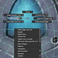
I have a two-button mouse set up in Maya and on my Mac I have right-click activated so when I work in Maya I can right click on my object and a menu will pop up. I can't screenshot this menu so I went to Google to get a picture. This menu allows you to go into vertex mode, edge mode, object mode and more. What we want is the textures on the bottom of this list. Create new.
With that new texture add a file. There is a black and white checkered box to the right of the color box. Click on it and click on add file.


I hope everyone already knows this, but I went everybody to be on the same page before we go onto the more complicated stuff. I don't want anyone getting lost.

IMPORTANT side note: NAME THINGS ALONG THE WAY!!!!!!!! It is very helpful. Don't be me. Please.


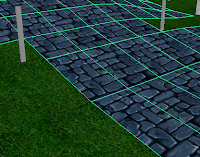
I will be bump mapping a walkway. In the picture you will see that I have my textured plane with blue stones. You will also see grass(that has been bump mapped. Doesn't it look AWESOME?!?!?!?). So I've clicked on my object and I want to have the attribute editor open and get to your texture.
If you just textured your object, you're already where you need to be.


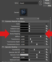
This is what you should be seeing on the right hand of you're screen. Get to this screen.

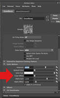
Those big red arrows is what we're going to be working with. But before we can add anything in to the beautiful bump map thingy. We need a black and white image of your texture. Or I need a black and white photo of my blue walkway.


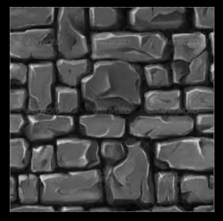
Bump Map Source Image
I took my tillable texture into Photoshop. I had my gravel on it's own layer. I then made this texture a grayscale. Why? Because Maya is weird and requires it to be in black and white. A little bit more about Maya's preferences when it comes to Bump Mapping. The white it elevated and the black is subtracted. So for my texture that means that if I want my bricks to be elevated above the grout, I need to make them more white and light gray and the grout black. The further back in space I want to make the bricks, the closer to black I make the brick.

Once you're done in Photoshop, save your file as a j-peg. Then put the image in your source image folder in your Maya Project Folder. I sincerely hope you have good file management for the sake of your sanity.

I have my Bump Map source image up just so you have an idea of what it should like it. But don't freak out if it doesn't. I'll be making more Bump Map source images, and I'll add them when I finish making TTP, because I know that there are so many different ways Bump Maps can be used so there so many ways your source image can look.


Now back to this screen in Maya! Remember those red arrows? Well they're important right now. Right under the arrow on the right hand side of that picture is a black and white square. CLICK IT!

There will be a menu that pops up. Press the FILE button. You add a file in the bump mapping thing like you would for a texture. If you can make a texture, you can create a bump map.


Once you add a file to the bump map thing, a new menu like thing comes up into the attribute editor. This menu allows you to edit a ton of stuff to your bump map image.

If you are going to edit anything in this menu I would suggest only messing with the color balance. The color balance is open in my image and it is by the single red arrow. To the left of this menu in Maya, you should still be able to see your object so when you make changes to anything in this menu please look at your object to see what you're doing. It's really important that you like what you're doing to your object.


This may be all you need to do. If you are pleased with how you're textured bumped, you don't need to carry on, but if you aren't pleased I have more!!!!


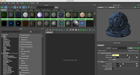
Now if you are unhappy with how your little bump depth there is on your texture, there is hope!!!! I have had the same issue with my gravel. What you do is go the window tab go down to rendering editors and click on HYPERSHADE!!!! The initial pop up screen will show you materials. You will see my material for TTP up. Please choose the texture you are currently bumping. Just to make sure you know what you're doing.
 Now go to utilities in the Hypershader. Utilities has a menu tab right above all the materials thumbnails on the left of the pop up (those beautiful spheres of all the textures you've ever used). Now if you are awesome, you will have named all your utilities. Or if you are like ME, you haven't and you have to search all of them until you find the one that is associated with the texture you are bumping. Pain in the neck I know. But it gets you results! I promise!
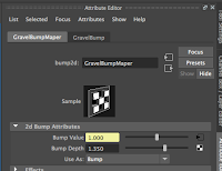
 Now once you click on the right one, you can mess with the bump depth in the Hypershader or the Attribute editor. They both do the same thing.

That's it! You're done!


September 24, 2015

New Levels of Animation

I recently read an article called Computer Animation Takes Films To Higher Level about how Disney and Pixar have reached new levels of animation. This is an old article. The director of Toy Story and A Bug's Life, John Lasseter, was talking about technology improvements shortly before the release of A Bug's Life. It talks about how Toy Story was so technically innovating and that the story was simply amazing but that A Bug's Life has made leaps and bounds in technology improvements since Toy Story, which came out three years prior to A Bug's Life. I thought that it was interesting how Lasseter explained that in A Bug's Life, they needed to show the transparency in the environment. It wasn't until a A Bug's Life that this technology was available. Why wasn't available before? Because the computers and the software wasn't powerful enough.

This was an informative article but I wanted more. As an animator I wanted more. I want to know how much has really changed since 1998. Like what more is there? How is there not more that John Lassenter said about A Bug's Life? A project that you work on is a pride and joy for you. It's hard to shut up about it. How dare you not include more of what Lassenter said about the amazingness of A Bug's Life. Tell me why I should care more about the technology advances and why they are so freaking cool. Don't you realize author that there will be future generations of animators that will care about this?

I didn't realize how much I take the transparency tools for granted. In a few years there will be greater tools that will make animation better and easier and they will be wonderful. But in nearly 18 years all the tools that have just come out will be taken for granted. It's incredibly weird, but why do we care? This is a basic tools we're talking about. Transparency is a tool that I've never not had. The new stuff coming out, the new Autodesk updates, the new Adobe updates, the new tools that are being added will shape the way students learn animation and the tools they "grow up with" will be taken for granted and they will find so absurd that I could have learned animation without those tools. What a strange thought isn't it? The inevitability of it and the uncertainty of it. But the truth of it.

September 04, 2015

Torn To Pieces

I'm going to be working on an animation that I'm thinking of calling Torn To Pieces as the title of the blog suggests. And this blog post will tell the story of  Torn To Pieces. So if that changes, I'll let you know, but I won't be changing the title of this blog post if I do.

This is part of a duo project. Everybody Wants to Rule the World will be the companion to this project.

The Project BEGINS
 So at the end of my junior year of high school (2014-15 school year) my animation mentor says, hey all of you should think of awesome ideas to make animations from next year. You should have like 3 ideas that somehow relate to each other. So I did. And sadly one idea has to be let go due to time restraints. Darned deadlines! But hallelujah graduation! This one gets to survive! So YAY!

So here is the basic scope of the project: There will be a child whose parent or parents have been murdered. They feel guilty and the death(s) replays in their mind continually. I think I'll open with the child walking to the grave(s) of his parent(s) and sees them die and can't help but feel like it's his fault. For the moment I want to have 'Wicked Ones' by Dorothy be the music for this, but it is very upbeat so this might change. (FYI, this paragraph is from the blog post Triad Project, so this is from that post plus MORE!!!! Read the post mentioned previously if you have not already. I will try to explain everything from that post, but there is a post that comes before this one. Just so all of you know.)

Ok I've changed the song. It will not be Wicked Ones by Dorothy. Instead it will be Torn To Pieces by Pop Evil. I might end up calling the piece Torn To Pieces, but I don't know yet. I'll ask around and gain other people's opinions before deciding.

Pre-Production
 So far I have no concept art that I will be using. As I draw things, I will update all of you as I will start working on this more and more once I have complete storyboards. So pictures WILL come!!!!!

Finding music was a struggle! I wanted it to be kinda of sad but I liked Wicked Ones by Dorothy. But it was so upbeat I wasn't sure it would work. So I made a list of songs about death, hat I found on the glorious internet. Fun times listening to all the songs on the list. I crossed off so many immediately because I was like NO!!! NOT THE RIGHT MOOD!!! Music is a wonderful and horrible thing at the same time. Wonderful because it helps tell the story but a pain in the but when you're trying to find it. Gosh it took some time!

Well I finally decided on 'Torn To Pieces' by Pop Evil. I totally was seeing my idea beginning to play out to the music. I was like, THIS IS IT!!!! This is the song I've been looking for! Watch me hate it when I'm finished with this project. I'm not sick of it YET. Going to know what it is like for those video kids making all school videos. With the chance of it becoming far more annoying.


Story Boards
 My storyboards are DONE! It is a glorious 3 pages long. While storyboarding I realized that my song, Torn To Pieces by Pop Evil, was to long and that I would not be using the entire song. Less work for me I think, and hope. But this will be a long road to get where I need to be. I'm going to be getting to work. I'll try to keep you posted.

PS, I hope you can read the storyboards when I repost them that is. It is hard to blog and make the post look nice and the pictures aren't working with me so I'm leaving them off for now. I'm sorry for the inconvenience. If they still will not work I will give you the rundown of the story and what I have on my storyboards.

Modeling
I've been doing a ton of modeling. Modeling is hard for me to predict as I want to set deadlines to get things done but I tend to predict it wrong. Not awesome I know but I try and it normally gets me to get stuff done. Even though it seems like I've accomplished literally nothing.
For TTP I needed a graveyard. This was annoying all around. Creating it, texturing, and bump mapping. It was tedious work that I did NOT enjoy. 

I made a house for this project. Well kind of. I made three rooms. I made a kitchen, living room/ home theaterish room, and garage. The Living room is the room I really needed as that's the room that my character will be spending the most time in.  I made a couch and a side table. I duplicated them so the space looks used and like it was well used. I also made a coffee table. Then I made a flat screen TV. I textured everything. It was a pain in the butt. I don't really enjoy the couch texture but I couldn't find one I liked better and looked more normal and life like, so I left it as is. For the TV I put a still from Once Upon A Time. I thought the still fit with the idea of TTP. For the tables, I wanted them to be fancy looking. So I made the top of the table a slab of glass that was engraved on the bottom. To hold up the glass top, I made metal legs. The legs are really simple which is nice because I don't have time to be making it to fancy.

Then I also made a kitchen. I made the kitchen because there was no door between the living room and the kitchen and if the camera ever looked in the direction of the kitchen I wanted it to look like there was somebody living there and it wasn't a random room floating in the middle of nowhere. I made this nice and fancy I wanted to tie the living room and the kitchen together and the level of fanciness seemed like the best way to go. I'm really happy with the table and chair set. I feel like it has a level of sophistication that the living room had. I also LOVE the backsplash. It's just so fancy and pretty. I would love to have it in my future home. But thanks to this modeling and texturing experience I can not go to Home Depot without getting the urge to take pictures to get textures. The cabinets and appliances were a pain to texture, but I do like how they turned out. Oh fun note on modeling the kitchen, while lighting this scene, I discovered under the right lighting, the top of my cabinets sparkle. It's really cool! But I can't do it again as I have no idea how in the world I did it.

I also made a garage and cars. The cars are crappy as I didn't discover visor until after modeling them and I didn't want to retexture new models. I don't like this room nor it's models very much but they won't be seen much so they aren't as important. I really wished that Nathan Goldberg was still here as I would have loved to have him model the cars and garage for me. I would have been so happy to not have to do it as it is not my thingy. I don't do cars, so it would have been nice to have someone who knew what they were doing but no. Goldberg just had to graduate and leave me to struggle with modeling a car. But then a few weeks after finishing the garage, I discovered this wonderful editor called visor. It has pre-modeled cars that I really want and it makes me mad that I didn't find it earlier.

I've also worked on modeling the people that will be in TTP. I took a base mesh from Mudbox. I modified it as the ladies needed boobs. I also added clothing and eyes to all the humans. Hair has been the most annoying part of this process. I have made a little boy, a dad, and a mom. The little boy and the dad look exactly alike. The mom has nice long black hair and a purple dress. I don't think do much to texture them more than I have.